Working on re-writing and updating three manuals for Gov. users in Pennsylvania this week. I now know a lot about how fingerprint-based background checks are processed by the software (and by the users of the software) in PA. The more manuals I write the better my chances of someday winning on Jeopardy.
With the closure of the Amazon Hosted Stores on the horizon (official date sometime in 2016) we’re talking to potential clients who have been using that service. Whether considering other hosted services or doing a “build/host your own” store we’ve noticed that we’re giving clients the same basic list of items to think about when deciding which software/service to move to.
The standard set of “store things” are:
Ease of associating a custom domain.
Ease of adding items (sku, description, weight, price, category, photos).
If the photo can be zoomed into by the customer to look at details (Amazon provided that).
Being able to group items by category.
How to make items taxable (the store should know which destinations are taxable and how much).
Inventory control for the items (this is optional but definitely recommended especially since they are working with a fulfillment partner).
Difficulty of setting up shipping options (1-day versus 2-day, ups vs. usps, etc.).
Getting the shipping to (at least mostly) match the real cost of shipping (often done by adjusting product weights and/or the shipping tables).
Ease of offering partners and friends a discount code.
Ease of setting up coupons/discounts/sales.
Whether or not the store company deals with taking credit cards and just puts money into the client’s bank account periodically vs. the client having to deal with multiple vendors for their gateway, shopping cart, and credit card authorizations.
Reports are a plus (Amazon was horrible for that).
It’s also a plus if the store can accept PayPal as payment. Heck, Home Depot can now accept PayPal!
Is customer service by trouble ticket (like Amazon), online chat, email, or phone? And what’s the typical turn around on getting an answer if it’s by trouble ticket or email?
Also, some store systems are very USA-centric or are even USA-only and won’t ship outside the US. Square stores, for example, only ship to USA addresses. If you have customers in Canada or Mexico or are planning to have customers outside the USA you need to make sure your store system can handle everything from VAT to international shipping.
Only after considering the above list should you think about the look&feel — but unfortunately look and feel is usually the only thing a client wants to think about, and they often can’t move beyond “I don’t like the standard template.”
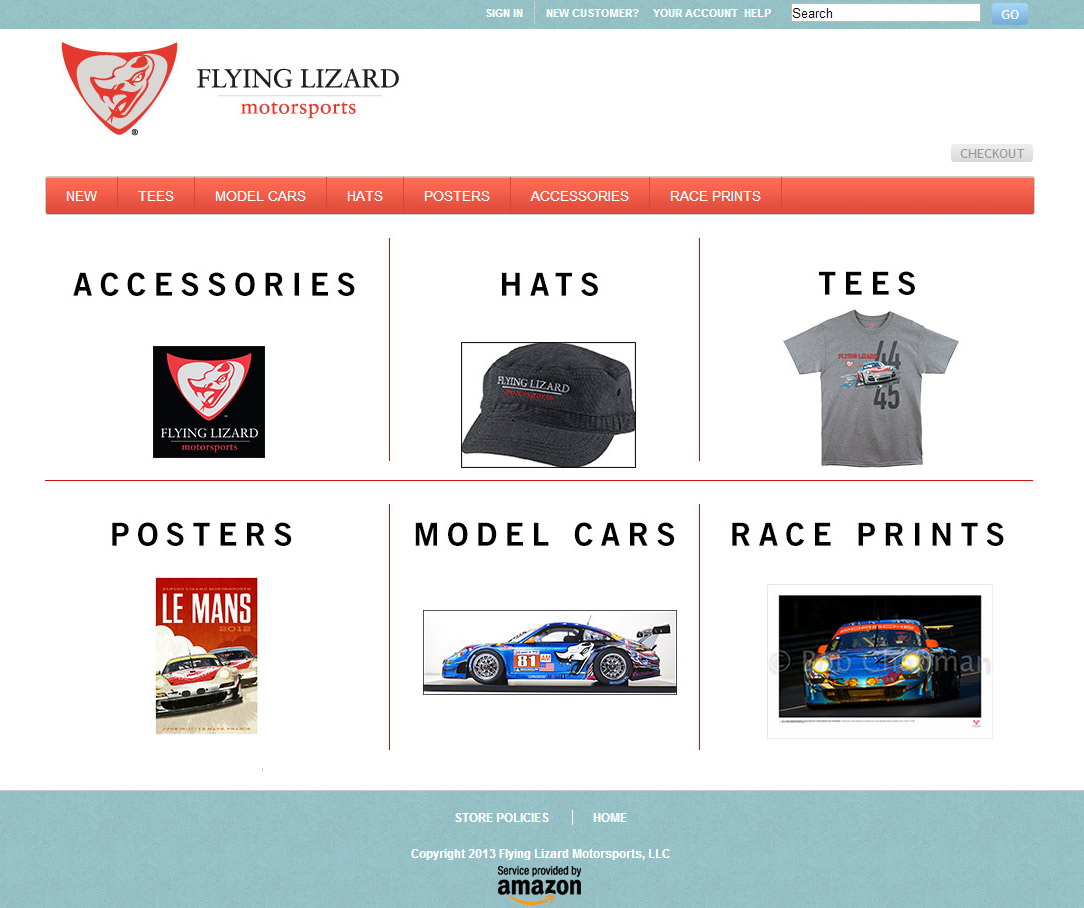
Typical front page of Amazon Hosted Store
At the end of the day thinking about the above list first will cure a lot more of your business headaches than focusing mostly on how the store looks. A store should be easy to use and understand for the end customer but having quality merchandise with good descriptions and photos will very often trump something that doesn’t look as fancy. Since in the end making sales is more important to a store than winning design awards we don’t hesitate to recommend a less-pretty system when it’s one that makes it easier for our clients. We’ll even recommend one with limited control over the look&feel if it’ll do a better job of meeting a clients’ needs, which is what we did when we recommended the Amazon solution to so many clients.
Here’s a recent response (with a few edits to protect confidentiality) to a question by a PR person who wanted to know how I’d redesign some single-page flyers for a client of theirs.
“I think {your client’s} projects are as much “information design” as they are graphic design. In other words the project isn’t just “how do I make this look better” but also involves thinking about how to categorize and “chunk” the information so it has more of an impact, and then design a layout that does a good job of both branding the client and getting the information read.
I’d be looking at the text not just as a graphical element, but also offering suggestions as to what parts of the text could be pulled out of the text body and be placed as bullet points at the top of the page for a quick scan (to increase the chance that {specific target} will see a point that matters to them and read the whole page), what generic information needs to be repeated on all printed items (similar to the “about us” footer on many press releases) so the documents could have all that in a unified header or footer area, and what fonts/colors/sizes need to be used to make the information read more quickly (since I feel that’ll be more beneficial to your client than just having the information look nicer).
Since the website uses photographs to make the message friendly and welcoming, I’d also be looking at how to integrate a key image or two with the same friendly feeling (maybe as sketches based on photos) into the layout, perhaps as part of the header/footer area so they aren’t taking up real estate needed for the main text — that way there’s more consistency between the website and the printed talking points than just using the same logo, which hopefully will make the information and the overall mission of {end client} more memorable. And finally, I’d also be looking at how those design choices could possibly be re-purposed in email footers and Word templates to make all the {end client} communication consistent.”